Oct 30, 2026Beauty Manufacturing Guides
Face Mask Packaging: First Impressions That Earn Trust
A mask is judged twice: once before purchase, once on the skin. Here is what the pouch has to accomplish first — clarity, recognition, and an unboxing worth the ritual.
Mask packaging has an unusual job. With most cosmetics, the container shows something close to the product — a cream jar is a jar of cream. With a mask, the customer cannot see the product at all: the pouch is the product, on the shelf and in the online thumbnail. That gives the packaging double weight. It has to win the first impression before purchase and survive the second one — the unboxing — after. Here is what it takes to do both, in the order most brands get it wrong.
Clarity Before Beauty
The first job is not decoration; it is orientation. A customer should know in three lines what the product is, what it does, and how to use it — the same three-line test we suggest for claims. Beautiful art with no answer to "what is this?" loses to plainer packaging that explains itself. Design earns its decoration only after the basics are unmissable: the mask type, the key ingredient story, the usage step. Confusion is the most expensive design choice available.
The Shelf Test — and the Feed Test
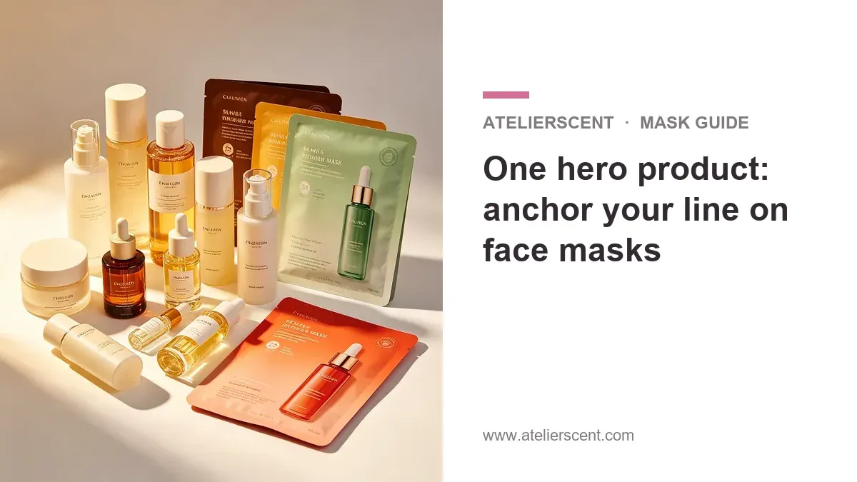
Good mask packaging passes two visibility tests at once. On a physical shelf, it must be recognizable from a meter away: one clear brand element, one clear color story, one hierarchy of text. In a social feed or a marketplace grid, the same pouch gets a fraction of that space — so the design must survive being small. The practical trick is to design at thumbnail size first, then check that it still works large. If your brand has an anchor product, this is also where its visual signature gets reinforced, so every future extension looks related.
The Unboxing Moment
Masks are ritual products — the session is the point — and the unboxing is where the ritual starts. The tear should open cleanly; the instructions should be readable at the moment they are needed, not buried; the order of use should be printed where our routine-pairing guide says it belongs. None of this requires luxury finishes. It requires deciding what the customer touches, reads and sees first, and designing that sequence deliberately instead of by accident.
On a shelf and in a feed, the pouch is the product. Make it a promise the formula can keep.
Decide Materials and Print With Your Factory
Finishes, films and foils all have real trade-offs in cost and durability, and your factory knows which of them it runs well — so make packaging decisions together with production, not before it. This is another place the five-questions habit from our private label guide pays off. At Atelierscent, logo and packaging design are handled in-house and free of charge, so the artwork, the claim wording and the print reality are reviewed as one piece before anything reaches a press — and the design work stays yours when the product ships.
Design the First Impression
Tell Diana Dong, Sales Director, at Diana@vipetsy.com what your mask should say at first glance, and get a quote with the packaging designed around it — clarity first, decoration second.